

User Research | Style Guide | Figma Prototyping

Designing an MVP for Local Community Vendors
Uplifting Small Business Vendors in the Texas Metro Area With A New Web Platform
Tools: Miro, Figma, Optimal Workshop, Google Slides
Introduction:
I worked on a team with two other designers to create an MVP for a web-based platform for a Texas-based start up, Local Community Vendors.
Local Community Vendors is a start-up run by Cindy Onyekwelu. She grew up attending local markets with her mother, who was a local vendor for seasonal decorations and crafts. At a young age, she understood the importance of community and running a small business that drove her passion for helping support these communities.
Local Community Vendors seeks to create an MVP web application that hopes to bring business back to the small market industry.

Understanding the small business market:
Farmers markets are a unique business structure: lower overhead costs and direct and valued contact with their customer base make for innovative and responsive vendors that can experiment with offering new items more easily. However, during the pandemic, markets saw a sharp drop in 79% of sales for these small businesses. LCV aims to bring the consumers back to these vendors and markets with an accessible platform that provides a directory of sellers and markets.
“But I fully believe if you are providing the best service, you can provide the best product you can provide. You’re not going to lose your customers.” -David Sargent Coffee


Research Findings
Our first conclusion was that no platform currently offers a service for vendors, market managers and customers. The platforms currently offering free registration offer the least features for their users. Local Community Vendor’s intention to make all features free would set them apart from their competitors.
We interviewed seventeen individuals who were associated with small markets. Thirteen of the seventeen interviews were an average of 20 minutes long, forty minutes being the longest interview. Four of the seventeen interviews were ‘guerilla’ interviews where we stopped people at our local markets to interview them for about 5-10 minutes each.

After we had a sense of trend categories, we identified the pain points of markets: communication between vendors and market managers, why people attended, and how they found the events.
These trends allowed us to focus on identifying our most viable features for our platform.
There are many types of people and aspects of a marketplace; because of this, we used the approach of an agile methodology to help address these needs.
When thinking about our main features, we took the approach of always having the vendors as a focus. Why? Because without their information, there would be nothing populating the site.

What were the key takeaways from our interview process?
Vendors: They need a streamlined approach to the market application process, and better marketing for their business’. Many vendors spoke about how long the application process was, and a lot of back and forth between market managers proved difficult for anyone who was trying to sell.
Market managers: Needed all the key information for specific market places and that some vendors were missing important information, this took up their time that took away from them promoting their markets to potential consumers.
Shoppers: Want a place where they can see who is selling, and what specific types of products are being offered. As well as a place for all the market information to be available.
Problem Space: Vendors needed a streamlined approach to marketing their products, finding markets to sell, and submitting their market applications.

We found that a possible solution here was to focus on three key features: streamlined market application process for vendors, a directory that showcased vendors to consumers and market managers in the area, and a local market directory filtered by location.

Our main persona, Bahn Mi Beni, is a local food truck vendor based in Austin Texas. Throughout our journey map, shown here, Beni struggles with the application process.
Ideating: Applying to a market
We conducted a treejack test of our site map to ensure a user friendly application process. After receiving the results from 16 users, we took a deeper look into the data and realized that 41% of the successful participants chose “information about applying” to submit an application. And so did 67% of the unsuccessful, which make up 65% of the entire group. This meant a lot of people chose “information about applying” to apply.

We concluded that a simple button to apply within that section could increase the success rate up to 88%. As an overall result, there was a success rate of 88.2%.
Sketching
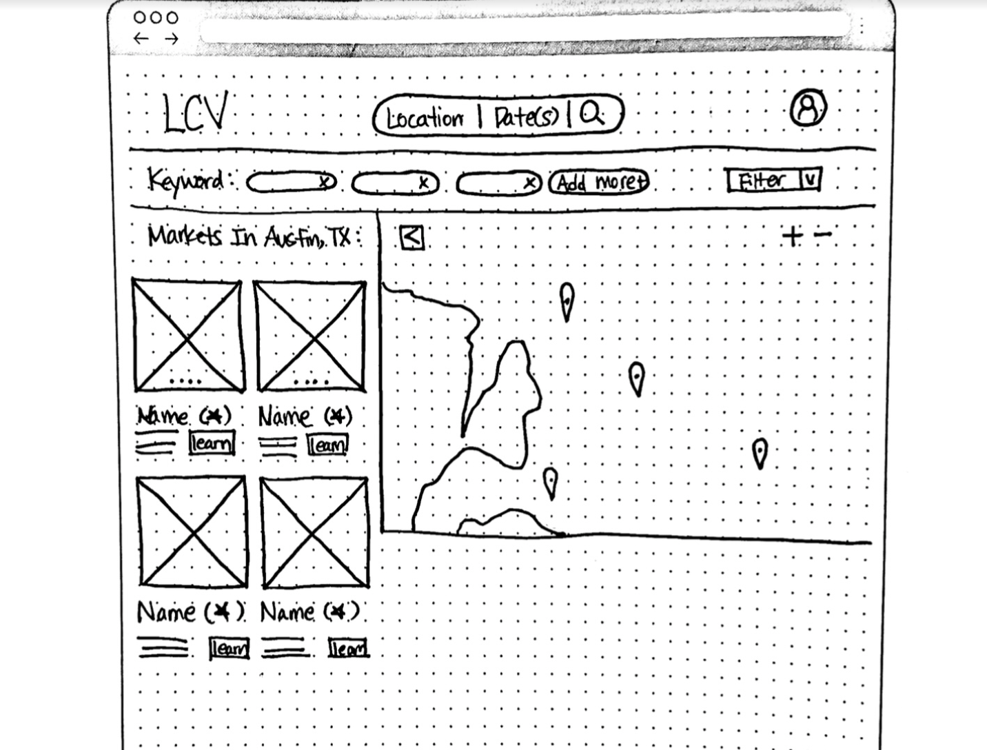
Moving on from our sitemap, each team member created a user flow for one of the three main features. Above is a map view of markets that I sketched out (re-drawn by Eileen for cohesiveness). We took these sketches and started bringing them into Figma.


While we started the design process, we all started some secondary research. I took inspiration from Airbnb’s platform for the map view of markets
We found that focusing on the Texas metro areas first made sense, since that’s where Cindy is starting out, so we added filters of Texas metro areas in our prototype.

There were many sketches, low-mid fi wireframes. Here is just one example of a sketch where we changed our design based off what we found most necessary for our users. A lot of content was to be put on this prototype, so we had to keep in mind that it needed to be simplified.
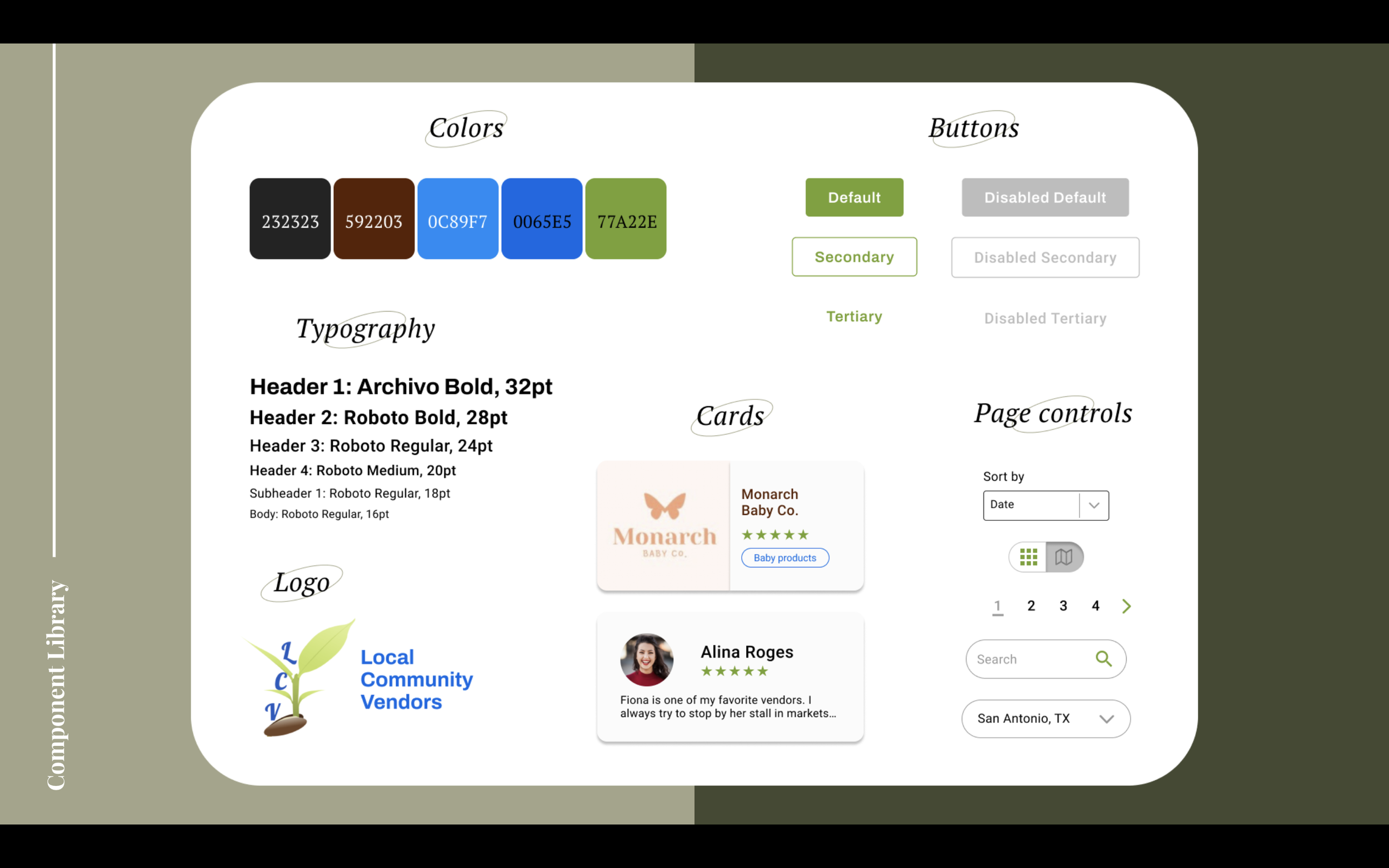
Visual Language & Branding
I got to work on a style tile for our hi-fi prototype (pictured above). I chose these colors with my teammates: green representing growth and comfort, blue and brown representing calmness and community.
For the fonts, Roboto was their primary font that the client chose, and I decided to pair it with Archivo, and a nice and bold sans serif font that is welcoming and not overpowering the rest of our designs.

Card Design
The last touch on our designs were the cards for the markets, vendors, and resources. I designed the market cards which served as the inspiration for the vendor and resource cards. With the guidance of my teammates, I used auto-layout and kept a clean and simple design that was inspired by Eventbrite.

Keeping Business goals in mind
After designing these cards and adding them to our pages for prototyping, we used a treejack test that Alice created, and asked users where they think they might find the tiered-priced marketing packages. Cindy’s main goal is to uplift these vendors' businesses, so she offers consultation packages if they need that extra boost in marketing their products and business story.
The treejack test results of sixteen users gave a unanimous vote of adding the marketing packages on the resource page, which we decided to add at the top of the page so that it was at the forefront and not an after-thought of Cindy’s business.


Local Community Vendors Prototype
For our final design, we created a platform that allows anyone to view vendors and markets by locations offered by LCV, for vendors to create and edit their profiles, save and submit applications for markets, and have access to resources such as articles and marketing packages offered by LCV. For more information, read my case study here.

Home Page of the new Local Community Vendors web platform. Banner designed by me.